


Table of contents
Introduction
Your Next Customer May Be Visiting From a Phone — 150 words
Your next customer may discover your business while searching Google, browsing social media, or following a link on WhatsApp—all from a smartphone. What happens when they arrive at your website matters. If the text is difficult to read, menus are awkward, buttons are hard to tap, or pages take too long to load, that potential customer may simply leave and choose another business.
This is where responsive website design becomes essential. A responsive website automatically adapts its layout, content, images, navigation, and functionality to different screen sizes, creating a smooth experience across smartphones, tablets, laptops, and desktops.
For Kenyan businesses, this is more than a technical feature. A well-designed mobile experience can help visitors find information quickly, build confidence in your business, contact you, request a quotation, make a booking, or complete a purchase.
In this guide, we explore how responsive website design in Kenya can turn mobile visitors into genuine business opportunities.
What Is Responsive Website Design?
Responsive website design is an approach to website design and development that allows a website to automatically adapt to the screen size and device being used. Instead of creating separate versions of a website for phones, tablets, and computers, one responsive website adjusts its layout, images, text, navigation, and other elements to provide a consistent experience across devices.
For example, a desktop website may display several navigation options across the top of the screen. On a smartphone, the same navigation can automatically transform into a compact mobile menu. Images can resize, columns can stack vertically, and buttons can become easier to tap.
How Does Responsive Website Design Work?
Responsive websites use flexible layouts, responsive images, appropriate typography, and design breakpoints to adapt content to different screen sizes. Developers also test pages across multiple devices and browsers to ensure important functions continue to work correctly.
Responsive Design Is More Than Making a Website Smaller
A truly mobile-friendly website is designed around how people actually use their devices. Visitors should be able to read content without excessive zooming, navigate easily, tap buttons comfortably, complete forms, and quickly find information.
For Kenyan businesses, responsive web design therefore provides more than visual flexibility. It creates a smoother digital experience that can help visitors stay longer, engage with your business, and take the next step toward becoming customers.
Why Mobile Experience Matters for Kenyan Businesses
For many Kenyan businesses, the first interaction a potential customer has with the brand may happen on a smartphone. People search Google for local services, discover businesses through Facebook and Instagram, click links shared on WhatsApp, and browse websites while on the move. This makes the quality of the mobile experience an important part of how customers judge a business online.
A website that is difficult to navigate on a phone can quickly turn interest into frustration. Small text, slow-loading pages, difficult menus, poorly positioned buttons, or forms that are hard to complete can prevent visitors from taking the next step. Even if the business offers excellent products or services, a poor mobile experience can make potential customers look elsewhere.
This matters across many sectors in Kenya. SMEs, professional service firms, hotels, tour operators, restaurants, ecommerce businesses, schools, healthcare providers, and other organisations all depend on their websites to provide information and generate enquiries, bookings, calls, or sales.
Responsive website design helps remove these barriers by adapting the website to the visitor’s device. More importantly, it allows businesses to create a clear path from discovery to engagement and conversion.
For a Kenyan business competing for attention online, mobile responsiveness is therefore not simply a technical requirement. It is an important part of creating a professional customer experience and turning website visitors into genuine business opportunities.
From Mobile Visitor to Customer: The Conversion Journey
Getting someone to visit your website is only the beginning. The real value of responsive website design is creating an experience that guides a mobile visitor from initial interest to meaningful action. Every element of the website should make that journey simple, clear, and convenient.
Step 1: The Visitor Arrives
A potential customer might find your business through Google, a social media post, an online advertisement, or a link shared through WhatsApp. The first few seconds matter. The page should load quickly, display correctly, and immediately communicate what the business offers.
Step 2: The Visitor Understands Your Offer
Mobile visitors should not have to search through several pages to understand your business. A clear headline, concise content, professional imagery, and an obvious value proposition help visitors quickly determine whether your products or services meet their needs.
Step 3: The Visitor Finds What They Need
Good mobile navigation allows customers to reach important information without frustration. Services, products, pricing, location, testimonials, contact details, and other essential information should be easy to find and read on a small screen.
Step 4: The Website Builds Trust
Before contacting or buying from a business, visitors often look for reasons to feel confident. Testimonials, customer reviews, portfolios, professional photography, certifications, company information, and clear contact details can reinforce credibility. A polished mobile experience also signals that the business takes its customers seriously.
Step 5: The Visitor Takes Action
A responsive website should make the next step obvious and easy. Depending on the business, this could mean tapping to call, sending a WhatsApp message, requesting a quotation, completing an enquiry form, booking an appointment, making a reservation, or purchasing a product.
Step 6: The Visitor Becomes a Lead or Customer
When the journey is well designed, responsive website design becomes more than a visual feature. It removes obstacles between the visitor and the desired action. A potential customer who can quickly understand your offer, trust your business, find the right information, and take action is far more likely to become a genuine enquiry, lead, or customer.
The goal is therefore not simply to make a website “look good” on a phone. It is to create a mobile experience that moves people naturally from discovery to understanding, trust, action, and ultimately business.
Is Your Website Turning Mobile Visitors Away?
Get your website checked for mobile usability, speed, navigation and conversion issues.
10 Mobile Experience Problems That Can Cost You Customers
A website can be technically functional and still provide a frustrating experience on a smartphone. Even small usability problems can cause potential customers to leave before contacting your business. Here are ten common mobile website problems worth addressing.
1. Tiny or Difficult-to-Read Text
Visitors should not need to zoom in to read your content. Text should remain comfortable to read on smaller screens.
2. Difficult Navigation
If visitors cannot quickly find your services, products, contact details, or other important pages, they may simply leave.
3. Buttons That Are Hard to Tap
Small or closely positioned buttons can make it difficult to call, submit a form, request a quotation, or complete another action.
4. Horizontal Scrolling
Visitors should not have to move the screen from side to side to see your content. This usually indicates that elements are not adapting properly to the device.
5. Slow-Loading Pages
Large images, unnecessary scripts, poor hosting, or excessive plugins can slow down a website, particularly on mobile connections.
6. Intrusive Pop-Ups
Pop-ups that cover important content or are difficult to close can interrupt the visitor’s experience and discourage engagement.
7. Complicated Forms
Long forms with tiny fields or difficult input requirements can cause visitors to abandon an enquiry before submitting it.
8. Important Information Is Hard to Find
Your phone number, WhatsApp contact, location, pricing, or services should not be buried several clicks deep.
9. Poorly Displayed Images and Media
Images that are distorted, cropped incorrectly, or too large can make a website look unprofessional and affect performance.
10. No Clear Call to Action
Visitors should know what to do next. Whether it is Call Us, Send a WhatsApp Message, Request a Quote, Book Now, or Buy Now, the next step should be obvious.
A responsive website addresses many of these problems, but effective mobile design goes further. The objective is to make every important interaction simple, fast, accessible, and focused on helping the visitor become a customer.
What a High-Converting Responsive Website Should Include
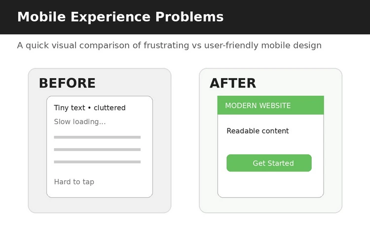
Responsive design provides the foundation for a good mobile experience, but responsiveness alone does not guarantee conversions. A high-converting website combines mobile usability with clear messaging, trust signals, strong calls to action, and a simple path for visitors to engage with the business.
Clear Mobile Navigation
A mobile menu should be simple and easy to use, allowing visitors to quickly reach important pages such as services, products, about, contact, pricing, or booking information.
Readable Content and Strong Visual Hierarchy
Text should be easy to read without zooming, while headings, images, and spacing should guide visitors through the page. The most important information should be visible without unnecessary scrolling.
Prominent Calls to Action
Visitors should always understand what they can do next. Depending on the business, useful CTAs can include Call Us, Send a WhatsApp Message, Request a Quote, Book Now, or Shop Now.
Mobile-Friendly Forms
Contact and enquiry forms should be short, easy to complete, and designed for touchscreens. Asking only for essential information can reduce friction and encourage more visitors to submit enquiries.
Fast-Loading Images and Pages
Optimised images, efficient code, quality hosting, caching, and other performance measures help pages load quickly and keep visitors engaged.
Easy-to-Use Contact Options
For many Kenyan businesses, making contact should require minimal effort. Click-to-call buttons, WhatsApp links, email addresses, maps, and enquiry forms can provide convenient ways for customers to get in touch.
Trust Signals
Testimonials, customer reviews, portfolios, certifications, client logos, secure connections, and clear business information can reassure visitors that they are dealing with a credible organisation.
A Clear Conversion Path
Every important page should have a logical next step. A visitor reading about a service, for example, should not have to return to the homepage to find out how to request it.
Ultimately, a high-converting responsive website is designed around the customer journey, not just the screen size. Its purpose is to make it easy for mobile visitors to understand, trust, engage with, and ultimately choose your business.
Responsive Design, Website Speed and Mobile Performance
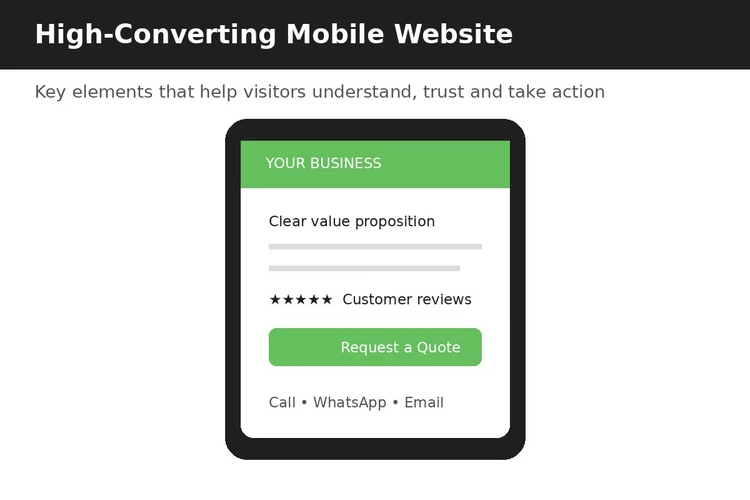
A website can be responsive and still provide a poor mobile experience if it takes too long to load. Responsive website design should therefore be considered alongside website speed and overall performance.
Mobile visitors may be browsing while using different networks, devices, and connection conditions. A page filled with large unoptimised images, unnecessary scripts, excessive plugins, or poorly configured features can take longer to display. When important content or buttons are slow to appear, visitors may abandon the page before engaging with the business.
Several practices can improve mobile performance:
- Optimising images so they maintain good quality without unnecessary file sizes.
- Using efficient website code and reducing scripts that do not contribute to the user experience.
- Implementing caching to help pages load more efficiently for returning visitors.
- Choosing reliable hosting that can support the website’s traffic and functionality.
- Using lazy loading where appropriate so resources are loaded when they are needed.
- Monitoring Core Web Vitals and other performance indicators.
For Kenyan businesses, a fast mobile website can make it easier for potential customers to browse services, view products, submit enquiries, or contact the business.
Responsive design makes the website adapt to the screen. Good performance makes that experience usable. Both are important when the goal is to turn mobile visitors into customers.
Responsive Website Design and Mobile SEO
Responsive website design and mobile SEO work together to help Kenyan businesses attract and convert customers who search primarily on smartphones. Google uses the mobile version of a website for indexing and ranking, making mobile usability an important part of an effective SEO strategy.
A responsive website automatically adapts its layout, images, text, buttons and navigation to different screen sizes. This creates a consistent experience across smartphones, tablets and desktops while avoiding the need to maintain separate mobile and desktop websites.
Mobile SEO goes beyond making a website look good on a phone. Pages should load quickly, use readable text, provide easy-to-tap buttons and make important information easy to find. Technical elements such as proper headings, descriptive page titles, structured content, image optimisation and Core Web Vitals can also influence the overall search experience.
For Kenyan businesses, this matters because potential customers may discover a company through Google while commuting, comparing suppliers or looking for a service nearby. If the website is difficult to use on mobile, visitors may leave before making contact.
A responsive, mobile-friendly website therefore supports both search visibility and conversions, helping businesses turn mobile search traffic into enquiries, calls, WhatsApp conversations and sales.
Ready to Make Your Website More Mobile-Friendly?
We can help improve your website's responsiveness, speed, usability and conversion experience across smartphones and other devices.
How to Test Whether Your Website Is Truly Mobile-Friendly
Simply opening your website on a smartphone and seeing that it loads does not necessarily mean it is genuinely mobile-friendly. A proper mobile test should examine usability, speed, navigation and functionality across different devices and screen sizes.
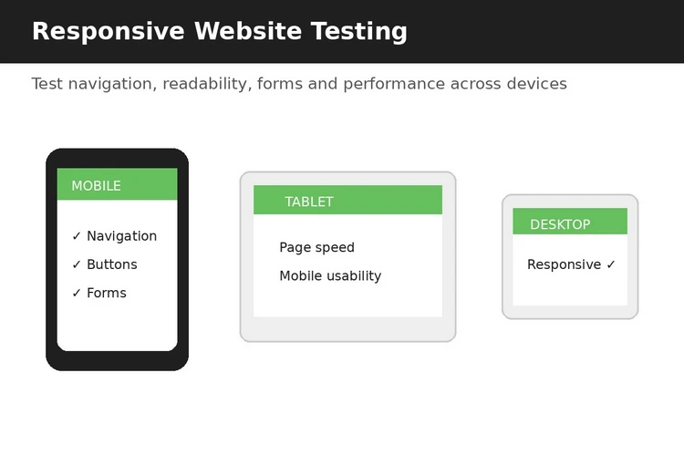
Start by checking how your website looks on several smartphones and tablets. Test both portrait and landscape orientations. Make sure text is easy to read without zooming, images fit within the screen and visitors do not need to scroll horizontally.
Next, test your navigation and important interactions. Can visitors open the menu easily? Are buttons and links large enough to tap comfortably? Do contact forms work correctly? Can users click your phone number or WhatsApp button without difficulty? Your most important conversion actions should work smoothly on mobile.
Page speed is another critical test. Large images, unnecessary scripts, poorly optimised plugins and slow hosting can make mobile pages frustratingly slow. Test important landing pages rather than checking only the homepage.
You should also test your website using Google’s mobile-friendly and performance tools, alongside real devices. Look for issues affecting loading speed, layout stability, accessibility and overall user experience.
Finally, ask someone unfamiliar with your website to complete a simple task, such as finding your services, checking prices or requesting a quotation. If they struggle, your website may need improvement even if it technically passes a mobile test.
Regular testing ensures your responsive website remains usable as content, plugins and technology change.
Can an Existing Website Be Made Responsive?
Yes. In many cases, an existing website can be redesigned or updated to become responsive without building everything from scratch. The best approach depends on how the website was originally developed, its content management system, theme, plugins and underlying code.
For WordPress websites, a developer may be able to replace or update the theme, adjust the page layouts and optimise existing content for mobile devices. Custom-built websites may require changes to the HTML, CSS and JavaScript to ensure that layouts, images, menus and forms adapt correctly to different screen sizes.
However, simply making the layout fit a smaller screen is not always enough. A proper responsive upgrade should also consider mobile navigation, page speed, image optimisation, buttons, forms, accessibility and the overall user journey.
For some older websites, modifying the existing structure may take more time and produce a less reliable result than rebuilding key pages or the entire website.
A professional website assessment can identify which option offers the best balance between cost, performance and long-term value.
Responsive Website Design Cost in Kenya
The cost of responsive website design in Kenya varies depending on the size of the website, its features, design requirements and level of customisation. A simple business website with a few pages will generally cost less than a larger website with advanced functionality, integrations or ecommerce features.
When comparing website design prices, businesses should look beyond the initial development fee. A responsive website should include mobile optimisation, fast loading performance, secure hosting, SSL, basic SEO setup and an easy-to-manage content structure.
Other factors that can affect the total cost include the number of pages, professional content, photography, branding, booking systems, payment integration, ecommerce functionality and ongoing maintenance.
For Kenyan SMEs, the most important consideration is value rather than simply choosing the cheapest option. A professionally designed responsive website should help the business build credibility, attract visitors from search engines and convert mobile users into enquiries or customers.
Choosing a Responsive Website Design Company in Kenya
Choosing the right responsive website design company in Kenya can have a significant impact on your website’s performance, usability and ability to generate business. Instead of focusing only on price, evaluate the company’s experience, portfolio, development process and understanding of your industry.
Start by reviewing websites they have designed and test those websites on your smartphone. Check whether the pages load quickly, navigation is simple, content is easy to read and important actions such as contact forms and calls work properly.
Ask potential web design companies whether responsive design, mobile performance, basic SEO and security are included in their packages. It is also useful to understand what happens after launch. Reliable support, maintenance, updates and troubleshooting can help keep your website performing well over time.
Look for a company that takes time to understand your business goals rather than simply offering a template. The right partner should be able to recommend a website structure that supports both your customers and your marketing objectives.
For Kenyan businesses, choosing an experienced local web design company can also make communication, support and understanding of the local market easier.
Frequently Asked Questions
1. What is responsive website design?
Responsive website design is an approach that allows a website to automatically adapt its layout, content and functionality to different screen sizes, including smartphones, tablets and desktops.
2. Why is a responsive website important for Kenyan businesses?
Many customers access websites through mobile devices. A responsive website provides a better browsing experience, helps visitors find information quickly and can support higher engagement and conversions.
3. Does responsive design improve SEO?
Responsive design can support SEO by providing a consistent website experience across devices. Mobile usability, page speed and other technical factors can also contribute to better search performance.
4. Can my existing website be made responsive?
Yes, depending on how your website was built. Some websites can be updated through their theme, layout and code, while older or poorly structured websites may benefit from a complete redesign.
5. How much does responsive website design cost in Kenya?
Costs vary according to the website’s size, features, design requirements and functionality. A simple business website will generally cost less than an ecommerce or highly customised website.
6. How do I know if my website is mobile-friendly?
Test your website on different smartphones and tablets. Check navigation, readability, buttons, forms, loading speed and important conversion actions to ensure everything works smoothly.
7. Do responsive websites work on all devices?
A properly developed responsive website should adapt to a wide range of modern screen sizes and browsers.
Conclusion:
Don’t Just Attract Mobile Visitors—Convert Them
A responsive website is no longer an optional feature for businesses that want to compete online. It is an essential part of creating a website that works effectively for customers using smartphones, tablets and desktop computers.
For Kenyan businesses, mobile-friendly design can make the difference between a visitor who quickly leaves and one who explores your services, contacts your business and becomes a customer. Responsive design should therefore go beyond simply making a website fit smaller screens. It should deliver fast loading times, intuitive navigation, readable content, clear calls to action and a smooth customer journey.
If your current website is difficult to use on mobile devices, slow or failing to generate enquiries, it may be time for an upgrade. Don’t just attract mobile visitors—give them a website experience that encourages them to take the next step.
Related Posts



Responsive Website Designing In Nairobi
August 1, 2026
LET'S BUILD SOMETHING GREAT
Ready for a better website?
Get a modern website designed around your business, goals, and budget.
Ready to Get Started?
Let's Build a Website That Works for Your Business
Whether you need a professional business website, an ecommerce store, a corporate website, or a complete digital growth strategy, our experienced team is ready to help you achieve your business goals online.
💼
View Our Recent Projects
Explore websites we've designed for businesses across different industries and discover what's possible.
View Projects📞
Book a Free Discovery Call
Speak with one of our website consultants, ask questions, and get expert guidance before making your decision.
Book a Free Call